Brand Identity Design for Leading Utility Industry Media Platform, Energy Central

Energy Central came to me with 25 years of history, a community of 240,000 utility professionals, and a brand that hadn't quite caught up with where they were heading. Over the past year they'd sharpened their editorial voice, launched into video, and started showing up IRL events. The brief was to tie it all together through newsletters, podcasts, web, sponsored content, social and events into one cohesive identity that felt modern, outdoorsy, and unmistakably them.

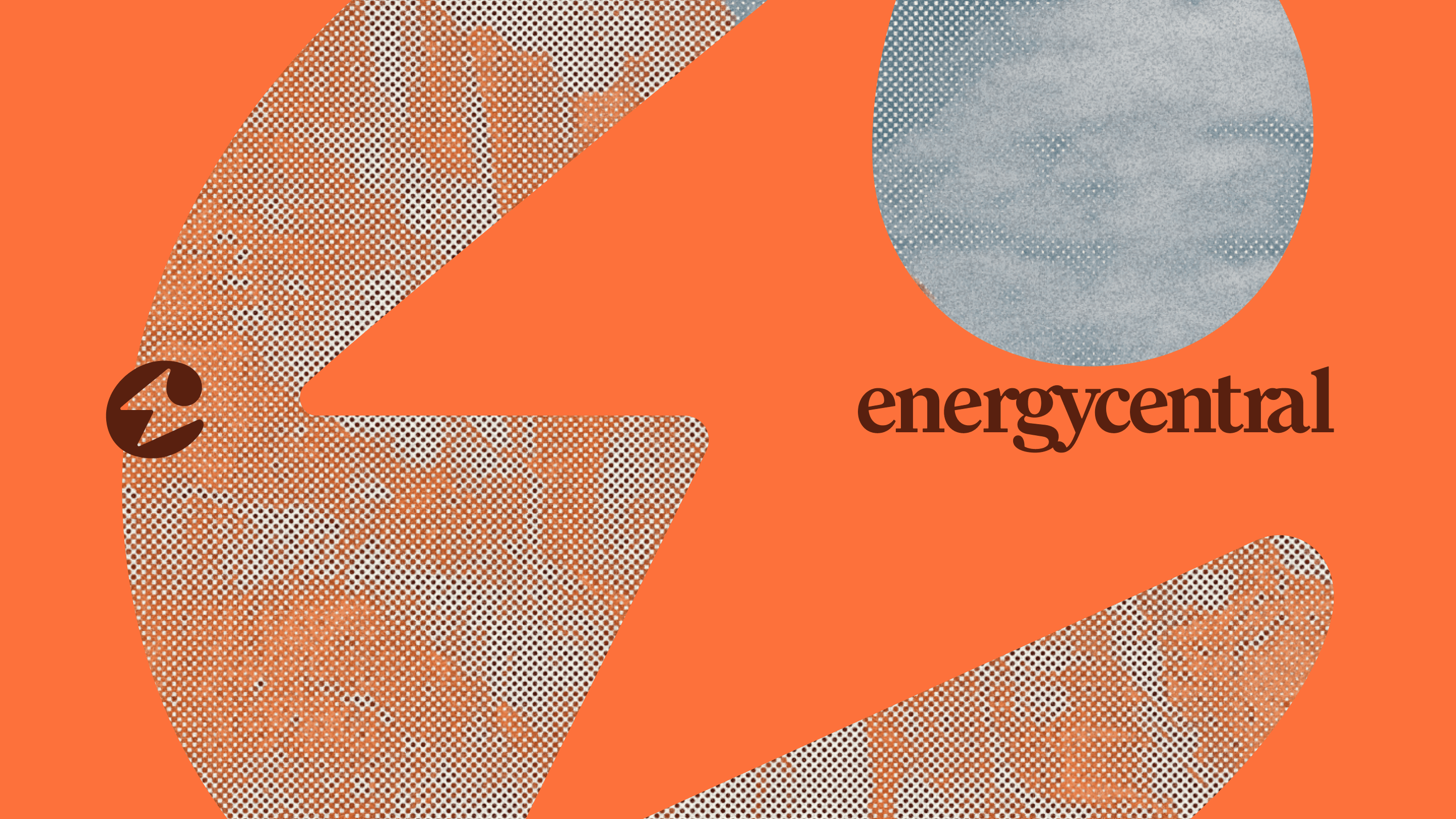
We landed on a strategic territory I'd describe as Smart, Cinematic, Outdoorsy, Expert a brand world that sits at the intersection of the natural landscape and the human systems that power it. The audience here isn't Silicon Valley tech bros; they're engineers, operators, and execs who hike on weekends and live the systems they work on. The brand slogan became simple energy is everywhere.
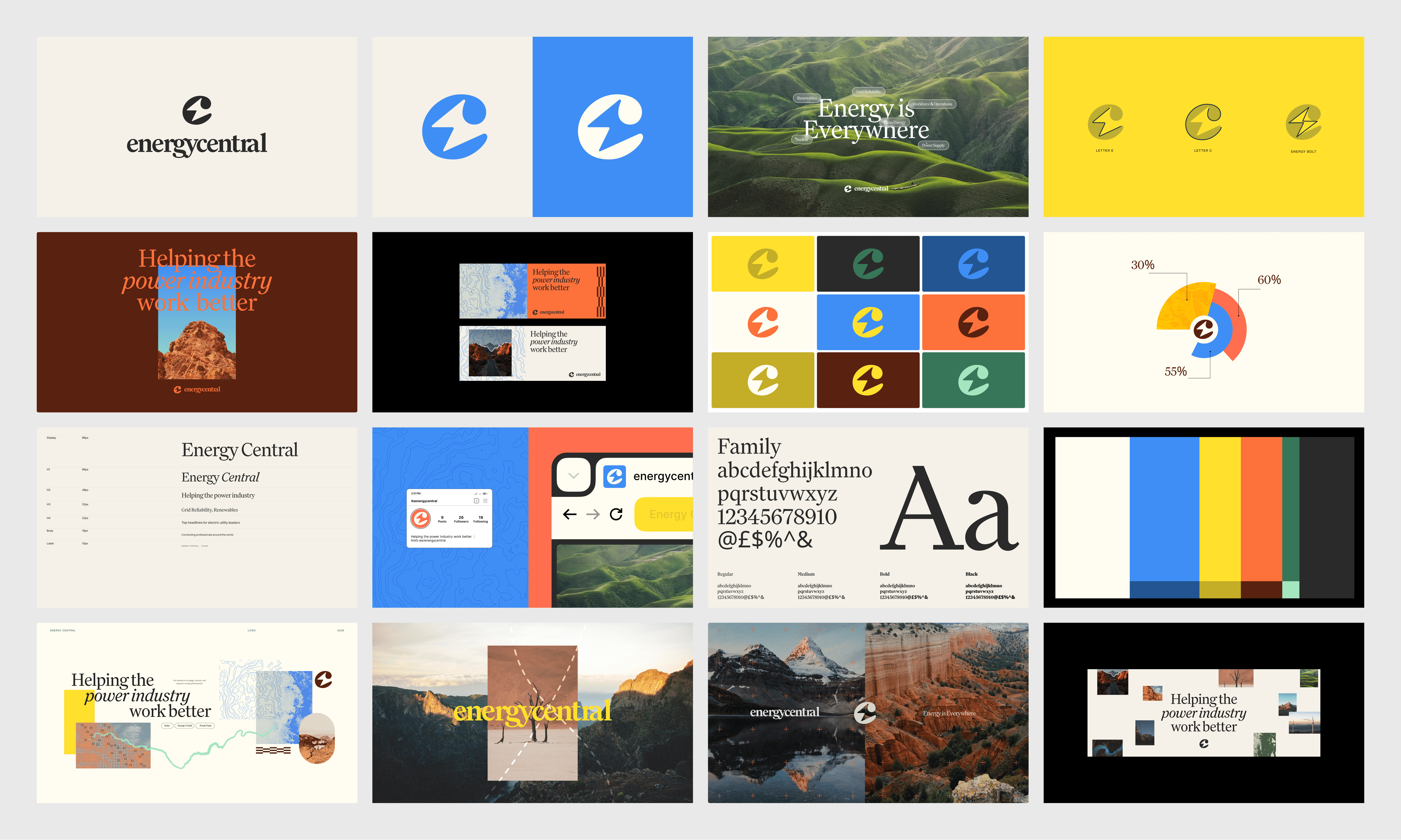
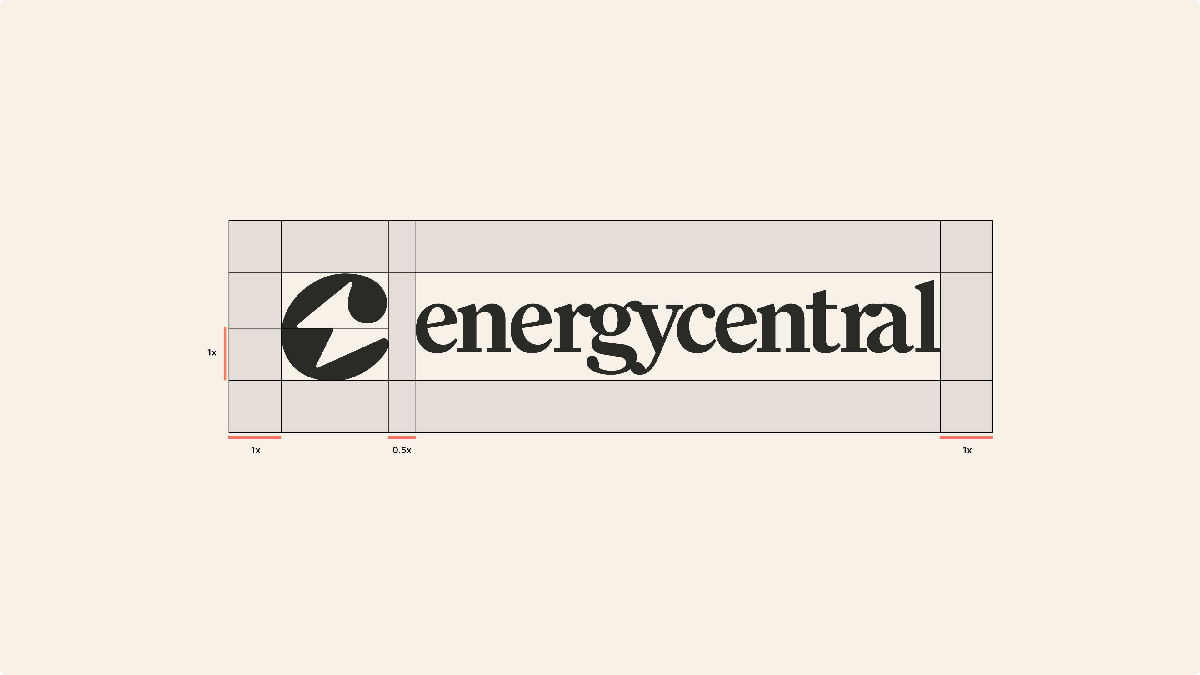
From there, my role was to take that territory and push it into a fully realised identity. The wordmark had to feel like a real media brand logo confident, iconic, built to live alongside the publications this community already trusts. I explored a lot of directions before landing on a custom mark with a circular "e" device that could flex as a standalone icon across podcast art, social avatars, and favicons, paired with a wordmark that holds its own at editorial scale.
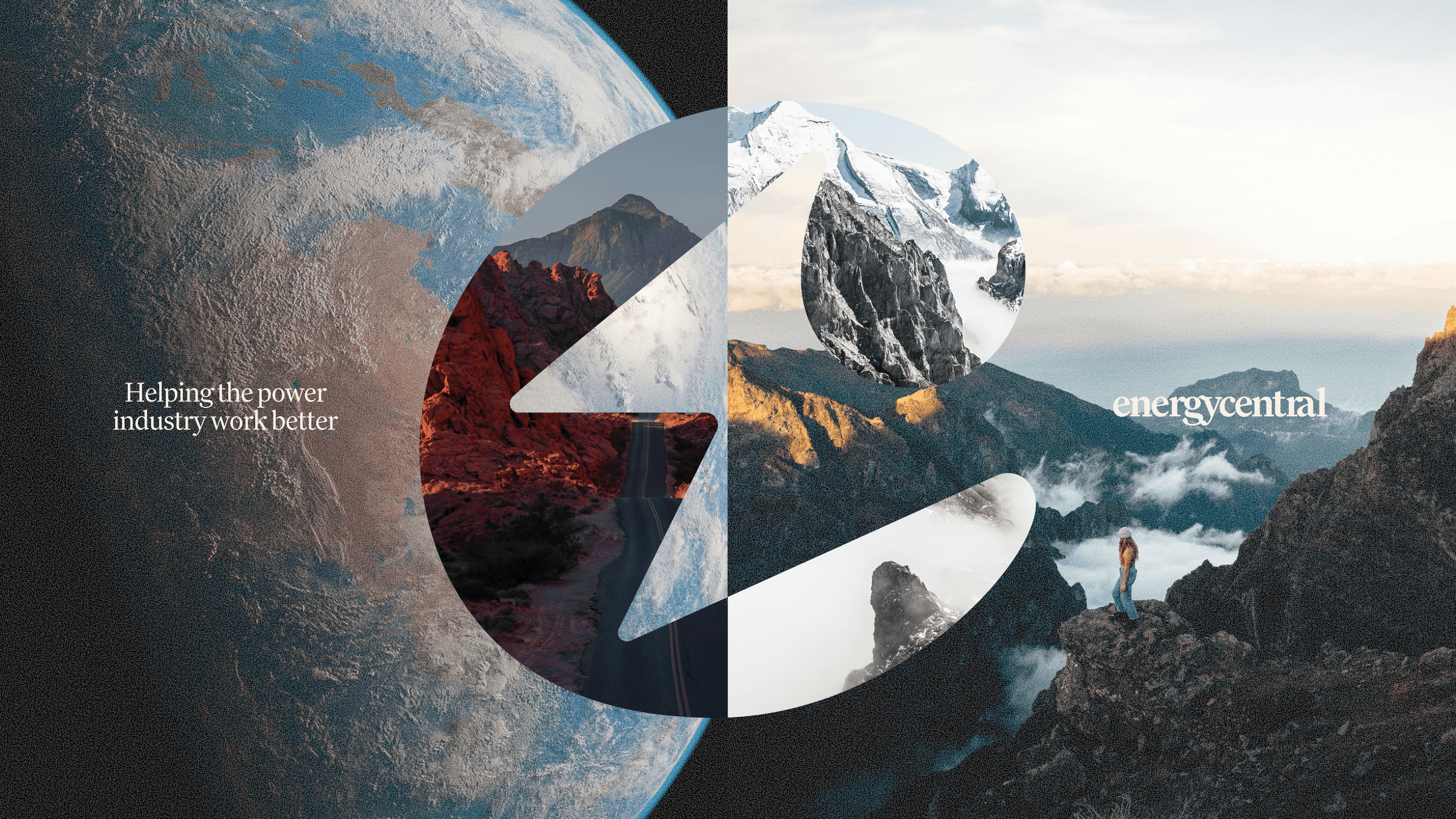

The colour palette was about balance, the editorial seriousness of the industry on one side, the openness of the outdoors on the other. We anchored it with a warm cream, a punchy utility yellow, a deep clay red, and an electric blue used sparingly for emphasis. Photography became the heart of the system: cinematic, real, desert, mountains, coastline, substation and skylines – overlaid with thin data lines and language that quietly tie the physical to the energetic.
The fun part was building it all out. Because most of the team works in Canva and Google Slides, every template needed to be lived in, not just looked at, flexible, on-brand, and easy to use without a designer in the room. That meant newsletter headers, social carousels, quote and stat cards, podcast covers, YouTube thumbnails, webinar decks, media kits, client reports, the lot. Both podcasts (Power Perspectives and The Watt and Why) got their own editable cover systems with guest headshot slots, and editable chart templates rounded out the kit so the editorial team could keep producing custom data viz without breaking the system.
The final identity carried that balance the whole way through a brand that feels alive, confident, and a little bit cool. One that reflects the grit and the innovation of the people it's built for, and gives a 25-year-old media platform a visual identity worthy of its next decade or longer!