Reload Logistics

Reload Logistics was entering a phase of growth and expanding operations, strengthening market presence, and redefining how it positions itself across Sub-Saharan Africa. With bigger ambitions came the need for a brand that could match their scale, clarity, and forward momentum. The existing identity lacked clarity, consistency, and contemporary appeal. It didn’t reflect the precision, ambition, or innovation that defined the company internally.
The opportunity was to create a unified brand system that could confidently support Reload’s next chapter and clearly communicate who they are today.
We partnered with the team to lead a full rebrand, re-shaping every visual touchpoint, across logomark and logotype design, colour and type systems, art direction, web design, and social assets, delivering a future-facing identity built to scale with the business.


The solution
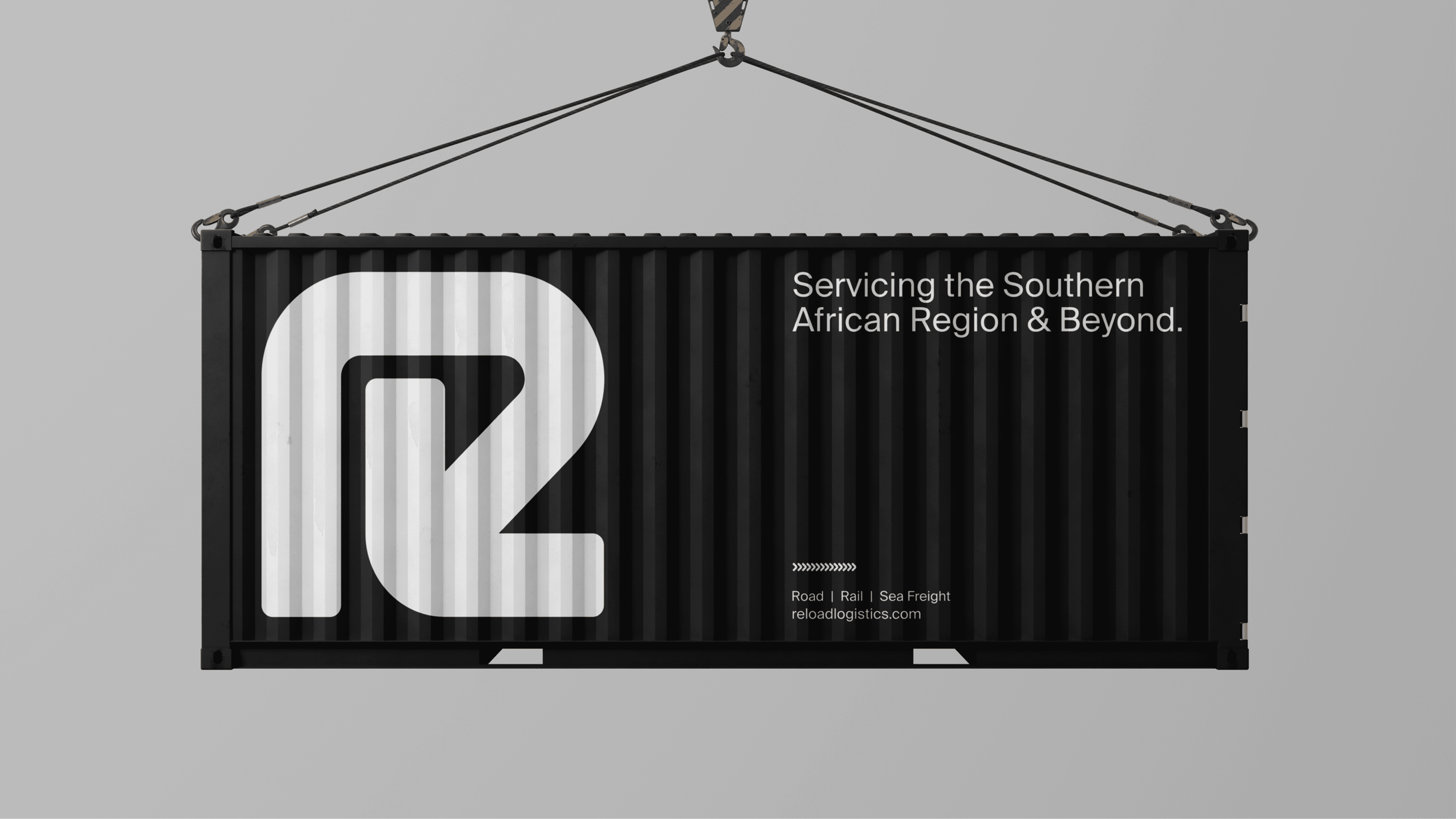
At the centre of the rebrand is a new bold, minimal and confident logo built for versatility across digital and physical environments. The mark evokes movement and connection, reflecting the dynamic nature of logistics without leaning into cliché imagery.
A refined colour palette balances strength with approachability, paired with a modern typographic system designed for both clarity and expression. Art direction focuses on confident composition and purposeful restraint, keeping the brand unmistakably professional while visually distinctive and memorable.
These elements were brought together through a fully redesigned website experience and a suite of social assets, ensuring a consistent presence across all customer-facing touchpoints.


The outcome
We delivered a cohesive identity that reflects the scale, energy, and ambition of Reload Logistics today, positioning the company as a forward-thinking industry leader rather than just another logistics provider. With a flexible system and unified visual language now in place, Reload has a brand built to grow: clear, confident, and ready to support continued expansion across new markets and platforms.